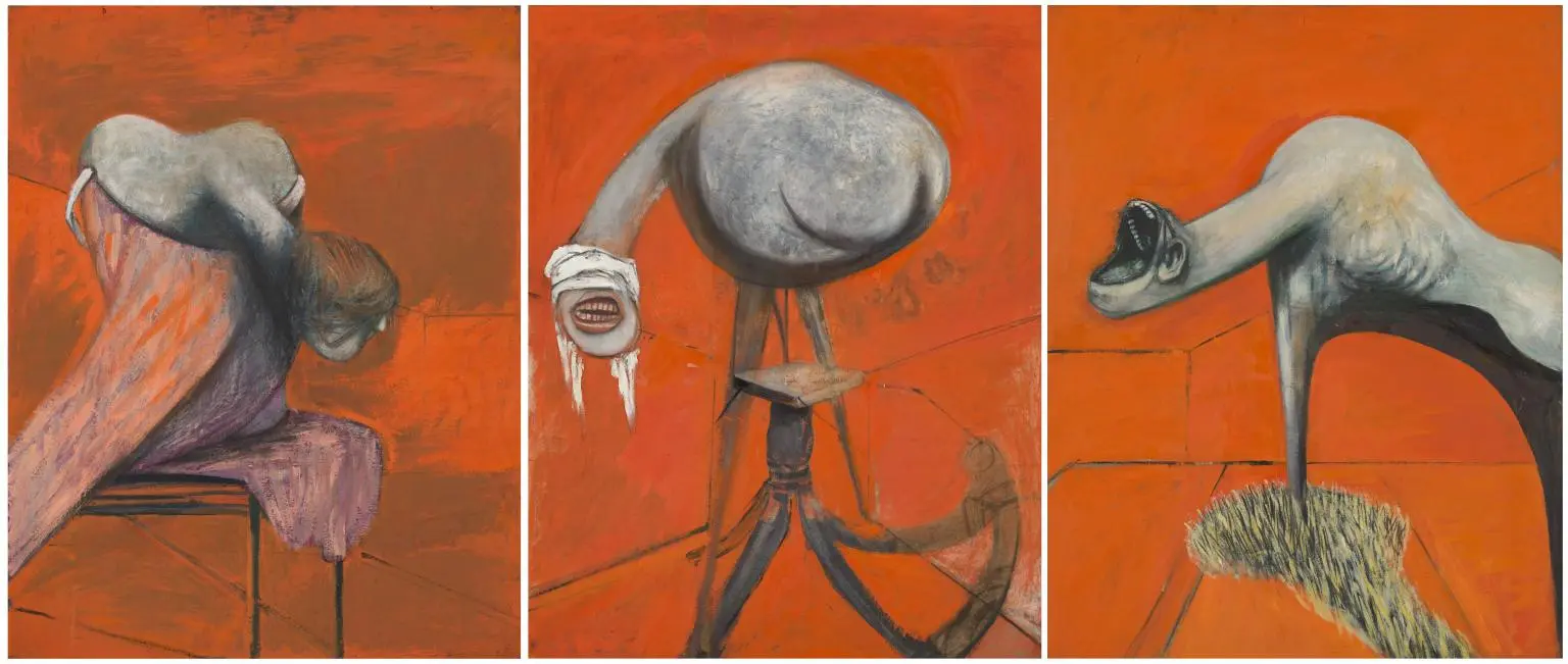
We got interested in a forecast of visual trends for 2020 published by Depositphotos International Stock Photo Bank primarily because it illustrates an important and already indisputable truth: painting, architecture, curatorial projects, design, popular culture, the ideas of video bloggers and retailers, and even more so instagrams and computer games in the 21st century create a single visual culture, a common set of themes, ideas, styles.

The Visual Trends 2020: Think Ahead project examines trends in visual communication to define how photography, graphic and web design mirror the artistic, social, and tech movements around the globe. And even if you are not associated with any of these professions, you will find interesting to know what visual content will accompany you next year in social networks, in commercials, on street boards, in museums. Everywhere, in a word. Well, and what does Mona Lisa, Kandinsky and architectural brutalism have to do with all this?
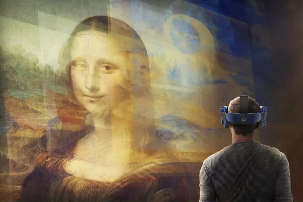
The Louvre launched the Mona Lisa. Beyond the Glass program, which uses Extended Reality technology, simultaneously with the anniversary exhibition of Leonardo da Vinci. Photo: magazine.artland.com
Extended reality
This trend takes first place in the Depositphotos review for a reason. Virtual reality will affect all spheres of human life the farther, the more: leisure, work, entertainment. And if you follow the news of the best art museums in the world and the most anticipated exhibitions, then, of course, you know that the extended (or augmented) reality becomes one of the most powerful tools for curators for organizing an important museum event.The Louvre used the latest technology to allow visitors to see the 3D model of Mona Lisa. Specialists studied the perspective, the landscape behind Mona Lisa, the textures and folds on her clothes, to recreate a three-dimensional model of the subject herself and the surrounding space. In the specially equipped room of the Louvre, you can spend 7 minutes alone with the Mona Lisa.
To a retrospective of Amedeo Modigliani, the artist’s Paris studio was recreated in 3D in London’s Tate Gallery. A burning cigarette smokes here, the wind plays with sheets of paper, fabric falls from a recently finished canvas, sunlight plays on the floor.
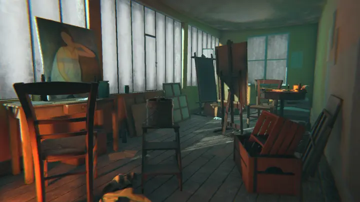
Modigliani’s studio, recreated in virtual reality for an exhibition in the Tate Modern Gallery. Photo: www.tate.org.uk
Finally, two years ago, the first full-fledged virtual museum opened. In the personal collection of the Dutchman George Kremer, there are 70 paintings by Flemish and Dutch artists of the 17th century. At first, he was going to build a museum and make the collection accessible for public, but then he decided that even more people around the world would be able to enjoy the paintings if they only needed to pay $ 10 and put on VR glasses. A special architectural project was created and optimal lighting was installed for the virtual Kremer Museum. You can view the paintings very closely, look at the back of the canvas and listen to the tour conducted by Kremer himself.
In a nutshell, the best world museums not only use the latest technology in their curatorial projects. They are the generators and popularizers of the ideas to come to the fore in visual communications in 2020. The most optimistic prophets from the IT world predict a too ideal future in which each museum will have its own virtual space, as an alternative to a living museum. And after some couple of years, we will be able to walk in the evenings in the virtual museum of d’Orsay or The Met, make the lights dimmer and drink tea in our kitchen in between the halls.
In a nutshell, the best world museums not only use the latest technology in their curatorial projects. They are the generators and popularizers of the ideas to come to the fore in visual communications in 2020. The most optimistic prophets from the IT world predict a too ideal future in which each museum will have its own virtual space, as an alternative to a living museum. And after some couple of years, we will be able to walk in the evenings in the virtual museum of d’Orsay or The Met, make the lights dimmer and drink tea in our kitchen in between the halls.
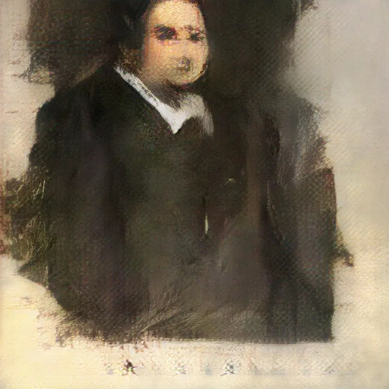
The Portrait of Edmond de Belami created by artificial intelligence, sold at Christie’s auction for $ 432.5 thousand
The dangers of technological progress
Admit it, you were a little scared from the previous prophecy. That’s it. This is just the next visual trend: the availability of technology and the dangers it entails. Technology is changing a lot: the way we watch exhibitions, the way artists and individual works become famous and marketable, and finally, how works of art are created. And although, for example, the first experience of selling a work created by artificial intelligence at Christie’s auction was unexpectedly successful (they planned to sell the painting for 10 thousand dollars, but sold it for more than 432 thousand), the programmed masterpieces still haven’t captured art market. So it’s too early to sound the alarm.In fact, the confrontation and dialogue between the artist and technology is not a new story. At each new round of development, it is repeated. Perhaps that is why, following the futuristic visual trends in the 2020 list, there are several reflections over the artistic experience of the past.
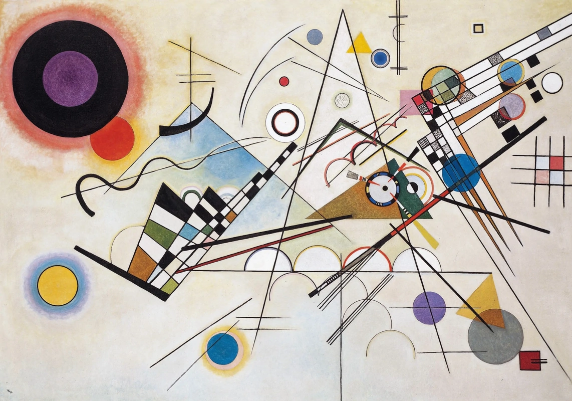
A 19
1927, 80×95.5 cm
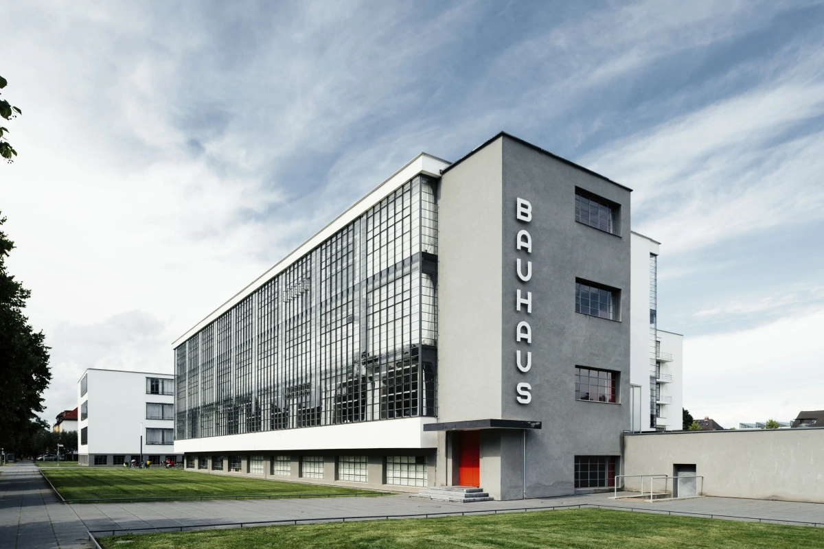
Bauhaus: back to the future
The interest in the aesthetics of the Bauhaus warmed up in 2019 primarily by a grand celebration of the centenary of the art school. During the year, art exhibitions were held on both sides of the ocean, theatrical productions of Oscar Schlemmer were reanimated, films were shown in the cinemas, they published books by the Bauhaus chief theorists and restored iconic buildings by the significant date, even food stylists laid out food on plates inspired by Kandinsky and Gropius. Passion for geometry, minimalism , basic colors, innovative Bauhaus typography were unexpectedly relevant and convincing in design.The Bauhaus turned out to be the necessary step backward for adjusting the visual compasses of our time: exactly one hundred years ago Walter Gropius, the founder of the High School of Construction and Art Design, laid the foundation for modern design; exactly one hundred years ago the building of the school itself, the house of teachers, the Haus am Horn exhibition house changed the idea of architecture. The Bauhaus was the first art school in Germany in which more girls were admitted in the first year of study than boys. For the first time, it was within the walls of this school that students not only developed design and projects, but also independently made dishes, lighting systems, textiles in their own workshops.
The Bauhaus experience will be useful in 2020 not only as a visual inspiration and a source of accurate minimalist solutions, but also as an example of the most daring and radical synthesis of the latest technologies and art in the history of art.
But the strict perfection and laconicism of the Bauhaus in the coming year will not be the only way to solve modern visual problems using travels to the past.
But the strict perfection and laconicism of the Bauhaus in the coming year will not be the only way to solve modern visual problems using travels to the past.
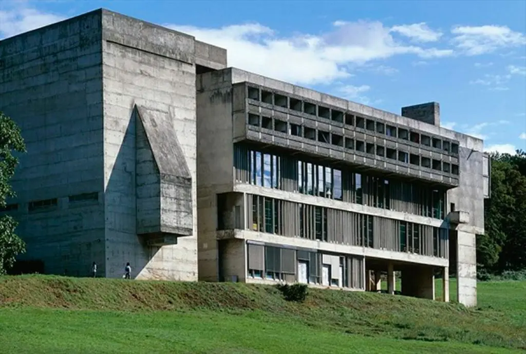
Le Corbusier. Monastery of Saint Marie de la Tourette, 1960
Brutalism: a challenge to boring excellence
Brutalism is one of the most controversial styles in architecture, the interest in which has suddenly increased in recent years, primarily thanks to movies and Instagram. Do you remember the impressive play of light and shadow on the rough gray surface of urban high-rise buildings that suddenly fell into the lenses of professional photographers and Instagram bloggers? And the mighty, crushing concrete setting of Blade Runner 2049? Cameraman Roger Dickins, who received an Oscar for working on this film, told in an interview that Denis Villeneuve, when setting the task for the film crew, said: "…I want the feeling of brutalism, the rigid concrete architecture feeling born in 1950s".Brutalism has an ambiguous reputation: on one hand, it is accused of dominating of the faceless typical high-rise buildings and even the heyday of crime provoked by such dull concrete quarters, on the other hand, concrete high-rise buildings solved the problem of the affordable housing in the post-war period. Perhaps, not a single direction in architecture has undergone such a serious test: such mass replication, simplification, depreciation.
The term "brutalism" was created by the British architects Alison and Peter Smithson, but it comes from the béton brut (raw concrete) technique used by the prophet of brutalism, architect Le Corbusier. And his plans, of course, were not to provide the armed gangs and drug dealers of London, Marseille or Paris with inspirational decorations. Le Corbusier came up with the idea of building houses on concrete supports, freeing the walls of the bearing function, and thus diversifying the layout; he came up with external concrete shutters that saved from the scorching heat, and installed running tracks, stages and terraces on the roofs. Le Corbusier planted the land freed from development thanks to multi-story construction with parks so that people in big cities finally began to breathe. In one of these apartments, he has been living for 30 years.
Brutalism is not only residential high-rise buildings though. In the second half of the twentieth century, state institutions, universities and museums were built of raw concrete. Concrete turned out to be such universal, silent, harsh, expressive material that it became the only possible language of sculpture to speak about the difficult events of the past. In Berlin, the Holocaust Memorial is a field of 2,700 concrete slabs and a sensation of piling, endless human pain.
All these meanings are automatically understood when, for example, a film director makes a dystopia in such sets. But even without them, brutalism challenges the dull beautifulness and faceless perfection.
All these meanings are automatically understood when, for example, a film director makes a dystopia in such sets. But even without them, brutalism challenges the dull beautifulness and faceless perfection.
The following five visual trends of 2020 are not directly related to the artistic and architectural trends of the past. No more revolutions and contradictions, no social context and threats. Rather, these are tips on colour schemes and compositions that could help attract the attention of the viewer. And, for example, if you planned to just become famous on Instagram next year, you can search for sharp planes of light and shadow on the walls of the nearest brutal high-rise building, construct seasonal fruit compositions in the Bauhaus style, or choose one of the following tips. And we will help you with a picturesque inspiration.
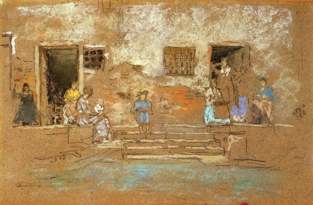
Pastel tones
Neon cyberpunk is now at the peak of popularity (this is one of the futuristic trends), so use pastel colours, conquer the world with all shades of beige, white, pink or mint. The tonalist Whistler, for example, did so a while back.Deformation and optical illusions
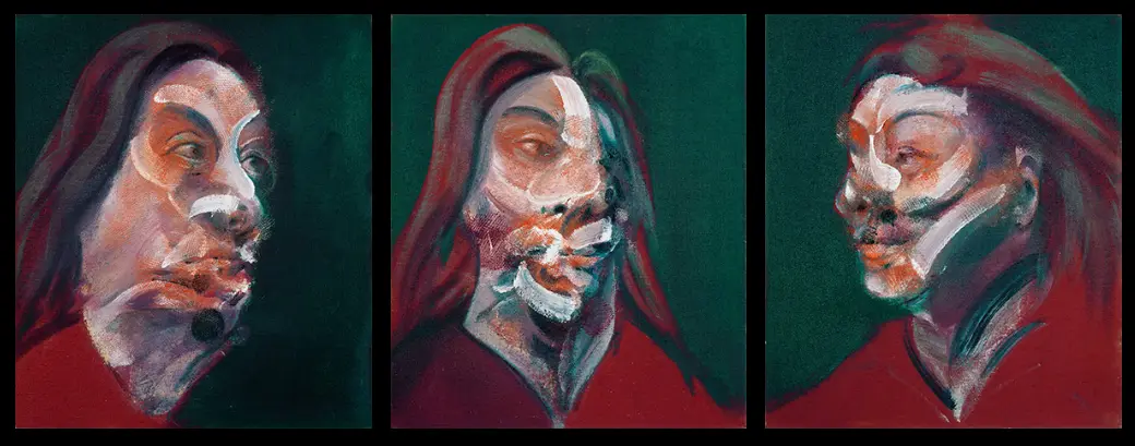
You certainly understand now that perfection is boring. It’s more and more difficult to attract the viewer’s attention with an ideal picture — there are too many of them. Therefore, distorted, deformed figures, optical illusions, uneven fonts — all these will make a person stick to the image and unravel it. Francis Bacon, Pablo Picasso, Maurits Cornelis Escher and Victor Vasarelli knew it for sure.Natural forms and the gravity law
They say that modern technologies enabled people to recreate natural movements, the hypnotic processes that had previously been available only to a scientist on the other side of the microscope, enchanting reactions. Designers and artists look at living forms and, using a set of modern techniques, overcome the laws of nature. The scientist Ernst Haeckel looked through his microscope at jellyfish and plankton for all his life, discovered unknown species (he counted 120 previously unknown creatures) and sketched bizarre and beautiful living forms. If you are in search of natural forms, then it is still best to look for them in Haeckel’s books.Vertical format
It is simple. People move from computers to phones and tablets, and therefore vertical images are better perceived. The device dictates the format of the picture. Artists and designers will have to deal with the compositional requirements of a vertical image. In painting, as always, you can find examples of a cardinally vertical canvas that not only better suited to the intended picture, but set the theme, challenged, determined the form.Close-up details
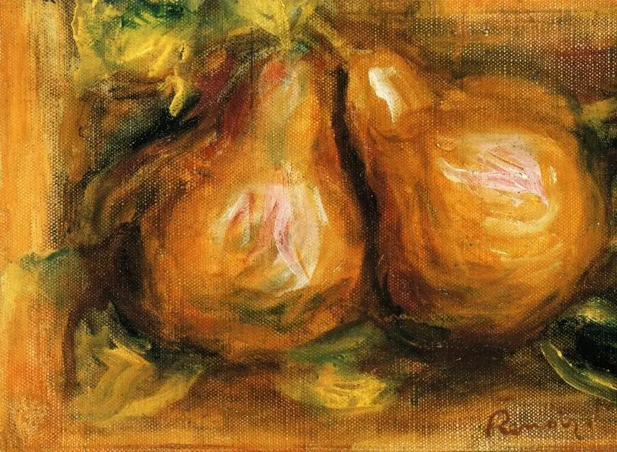
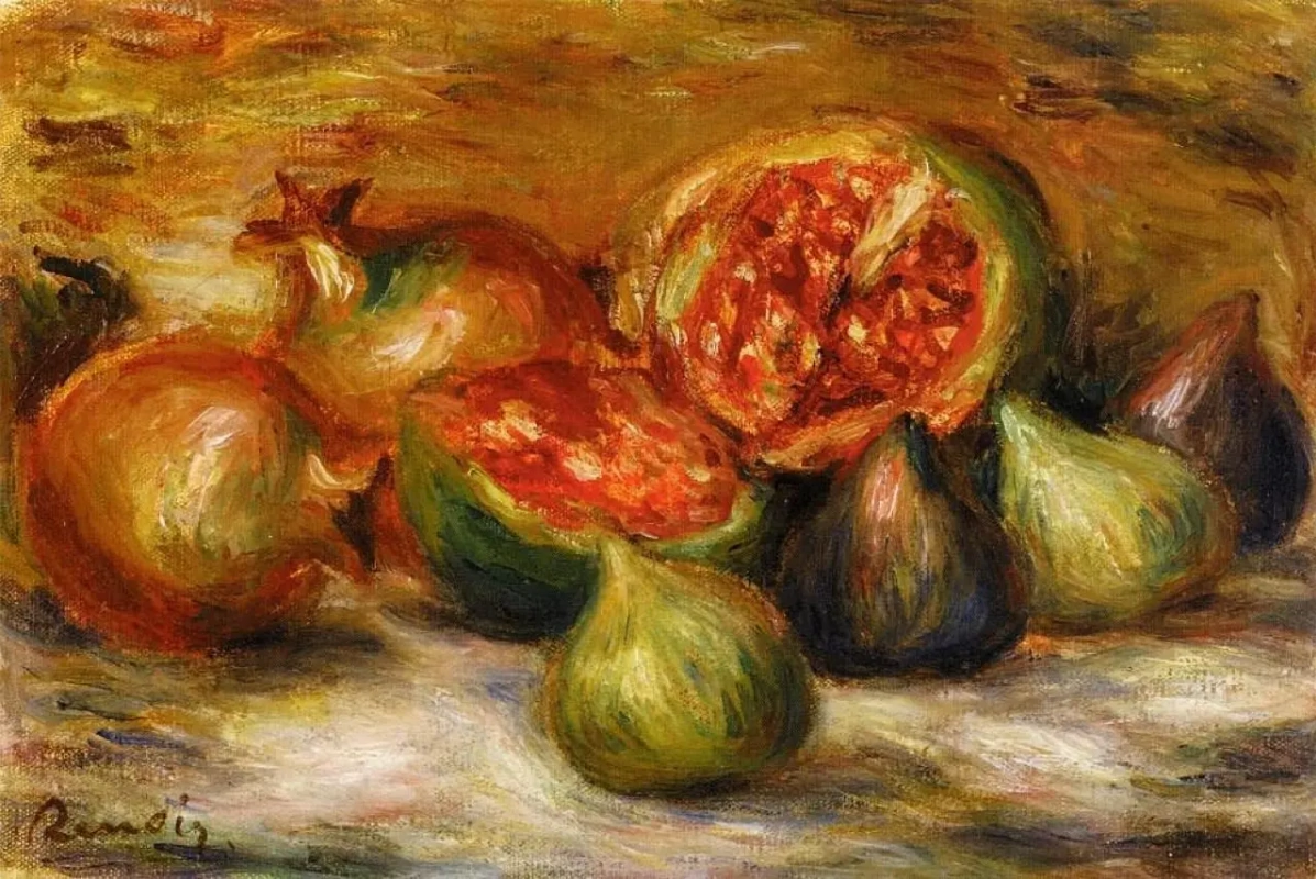
The minimalism and conciseness of the Bauhaus aesthetics came to the fore for a reason. Oversaturation and redundancy of images often lead away from the main thing, do not allow to consider the details. In the world of total informational fatigue, images with one single accent become noticeable — look for these in the later still lifes of the impressionists, for example. Edouard Manet and Auguste Renoir brilliantly mastered the technology; when they got old and sick, they laid an onion a bunch of asparagus in front of them and painted only them. Nothing extra.Artistes mentionnés dans l'article


