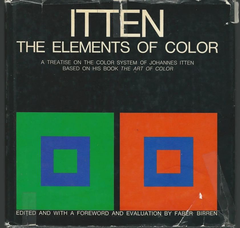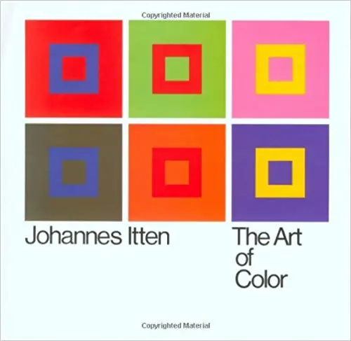
The Bible of colour: Johannes Itten "The Art of Colour"
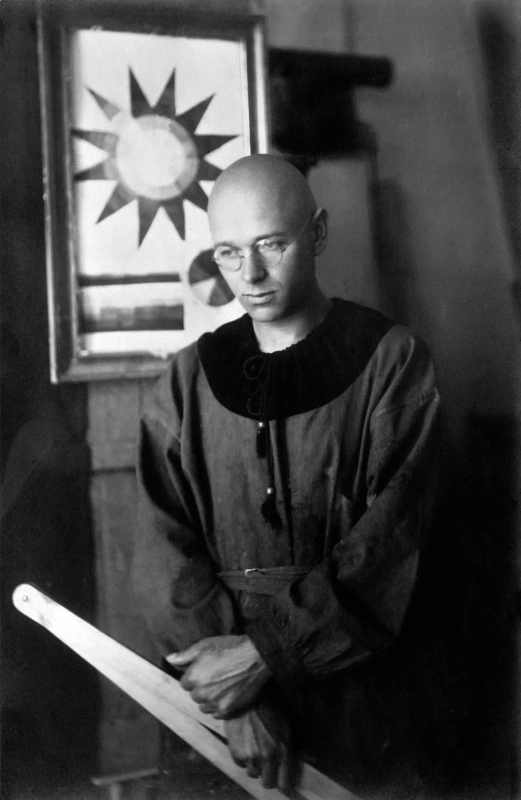
The author: It so happened that Johannes Itten is now known more as a teacher and author of several books, rather than an artist. He taught all his life — even before getting interested in painting, he worked as a teacher in a very small town in a rural area, and later became one of the main teachers of the avant-garde school of design, architecture, and applied arts — Bauhaus. Itten developed and conducted the Bauhaus preliminary course, and many years later, based on his theoretical developments and practical teaching experience, wrote two books: The Art of Colour and Design and Form.
Photo: www. bauhaus100. de
Itten came up with the 12-part colour wheel (already classic), in which, in addition to the three primary colours, he introduced second- and third-order colours, obtained by mixing the primary ones. He described seven types of colour contrast and devised exercises for understanding their properties, explained the features of colour impressions and gave tips on creating a more expressive image, using the right combination of colour and shape. The book consists of only 96 pages (the 2007 edition) — an admirable laconicism and semantic charge of every word Itten wrote.
Quotation: "It may seem strange to identify a sensation of temperature with the visual realm of colour sensation. However, experiments have demonstrated a difference of five to seven degrees in the subjective feeling of heat or cold between a work-room painted in blue-green and painted in red-orange. That is, in the blue-green room the occupants felt that
Drawbacks: none. We can hardly find any drawbacks in the book labelled as "cult", "resource", or "Bible".
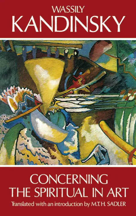
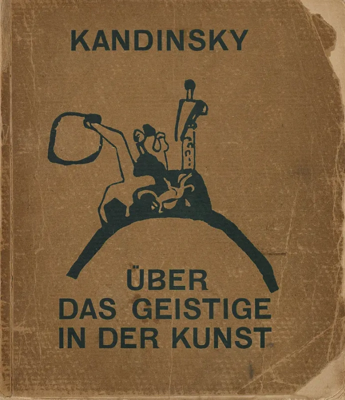
Sounding colour: Wassily Kandinsky "Concerning the Spiritual in Art"
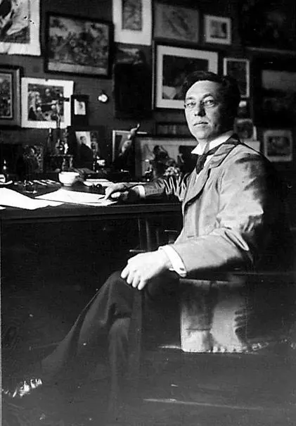
The author: Wassily Kandinsky was an artist, musician, teacher, practitioner and a theoretical writer. He is an example of a universal artist of the new time, who not only spoke about the synthesis of the arts, but also implemented those ideas. Kandinsky was the founder of the organization of artists The Blue Rider and the almanac having the same name, a teacher at the famous Bauhaus school in Weimar and the Moscow Sovmas (later — Vkhutemas), played the piano and cello, wrote poetry and stage compositions.
Photo: www.wassilykandinsky.ru
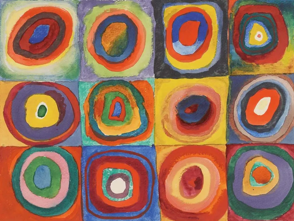
Kandinsky had synaesthesia, he heard how colours sound and vice versa — saw music in colour. Therefore, in music, a light blue sounded to him like a flute, a darker blue — a cello; a still darker — a thunderous double bass, and the darkest blue of all — an organ. The synaesthetic experience is quite unique in itself, but his research, of course, extends beyond it. Because of some descriptions of colour effects, combinations and harmonious contrasts, the reader wants to reread Kandinsky’s book and learn it by heart.
Quotation: "Warm red, intensified by a suitable yellow, is orange. This blend brings red almost to the point of spreading out towards the spectator. But the element of red is always sufficiently strong to keep the colour from flippancy. Orange is like a man, convinced of his own powers. This colour sounds like a church bell of medium pitch ringing the Angelus, or like a rich contralto voice, or a viola playing largo.
Just as orange is red brought nearer to humanity by yellow, so violet is red withdrawn from humanity by blue… Violet is therefore both in the physical and spiritual sense a cooled red. It is consequently rather ailing, outburnt (coal ash!) and sad."
Drawbacks: none. For more than a hundred years, nothing has changed in the perception of colour, moreover, nothing has changed in Kandinsky’s spiritual triangle, at the top of which stands an artist — a prophet, whose vision will help build a new section above the triangle and whose insights will become widely known and recognized.
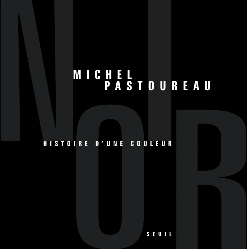
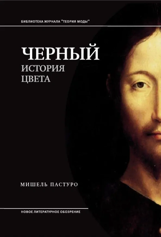
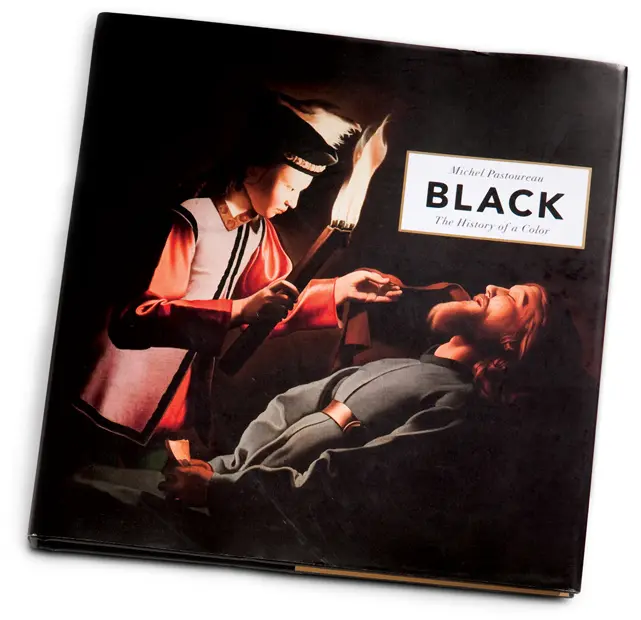
An unusual view: Michel Pastoureau "Black: The History of a Colour"
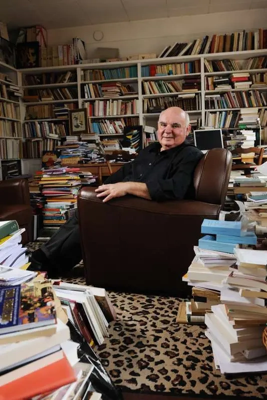
The author: Michel Pastoureau is a professor of medieval history and an expert on heraldry. The specific and narrow area of research allowed the French scientist to collect a tremendous amount of information about colours in general (and not only in the field of heraldry) and pictorial symbols in European culture. He wrote over 40 books, of which only two have been translated into Russian and published so far: those about blue and black. His studies on red and green are published in French and English.
Photo: elpaissemanal.elpais.com
It is impossible to write about black without mentioning other colours. Of course, Michel Pastoureau’s book focuses on black, but it is always in context: relations between black, white and red, dislike for the blue colour and brown, which for a long time had been considered black.
Quotation: "The only domains in which black seems to remain a dangerous or transgressive colour are those of verbal expressions and superstitions. They serve as vehicles for past beliefs and value systems, which neither social change nor technical progress, nor even changes in sensibilities have managed to transform or eradicate. In all European languages there thus exist many locutions in current use that emphasize the secret, forbidden, threatening, or harmful dimension of the colour black. Let us cite for French marché noir, travail au noir, mouton noir, bête noire, liste noire, livre noir, trou noir, série noire, messe noire, avoir des idées noires, broyer du noir, jour à marquer d’une pierrenoire (black market, moonlighting, black sheep, pet peeve, blacklist, black book, black hole, crime thriller, black mass, to have gloomy thoughts, to be down in the dumps, black day), and so on."
Drawbacks: black colour in painting and painting in general are of little interest to Pastoureau. Remember, he has been engaged in heraldry all his life. The author enthusiastically talks about the codes of honour of medieval painters and chivalric emblems, mentioning the meaning of black in painting even more rarely than the fashion for black.
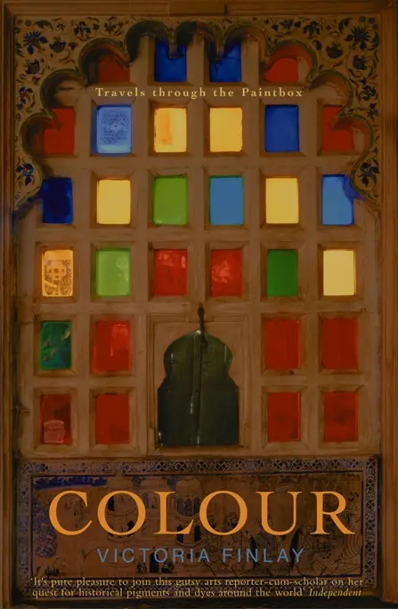
A journey in search of colour: Victoria Finlay "Colour: A Natural History of the Palette"
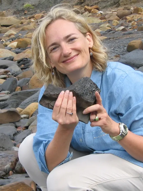
The author: Victoria Finlay is not a scientist or an artist, she is a journalist by profession and a social anthropologist by education, who worked for Reuters, lived in China for more than 10 years and was there a newspaper editor. In endless job interviews and reports, wherever it was possible, she unconsciously searched for stories about colours, until she realized that that topic was of huge interest to her. Then she went on a journey and travelled half the world, looking for these stories.
Photo: www.kiarts.org
You’ll certainly forget half of the stories right away (there are almost 400 pages in the book), and still you are sure to be willing to retell most of them to your friends and relatives. And you will always start with "Can you imagine.?" Can you imagine that cave paintings of Altamira were found accidentally by a little girl, who was a daughter of an amateur archaeologist? Can you imagine that the first synthetic dye was invented accidentally — a student of chemistry was looking for a chemical that helps treat malaria and found a purple pigment!
Quotation: "It was Easter vacation 1856, and 18-year-old chemistry student William Henry Perkin had been given a new material to experiment with. Perkin’s assignment from the Royal College of Chemistry, where he was a star student, was to use this coal tar to make a cure for malaria. (The only known cure came from the bark of the South American cinchona tree, a relative of the madder plant. The remedy was named "quinine")…
From his tiny laboratory on the top floor of his parents' home in East London, Perkin simply couldn’t make the right chemical compound. But one night, when washing out his flasks in some despair, he noticed a curious dark residue, which, according to his own words, he was going to throw out first, but then changed his mind. The solution of it resulted in a strangely beautiful colour. Perkin’s mauve was the first modern synthetic dye."
Drawbacks: confusion of narration and a huge amount of information: dates, names, place names and localities, several stories in one chapter. And also personal conversations and a series of exciting adventures and searches — everything we love about travel programs, but of which we quickly get tired in books.
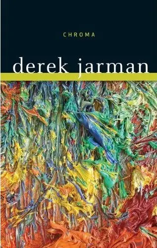
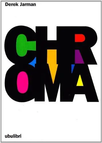
Poetry of colour: Derek Jarman "Chroma: A Book of Colour"
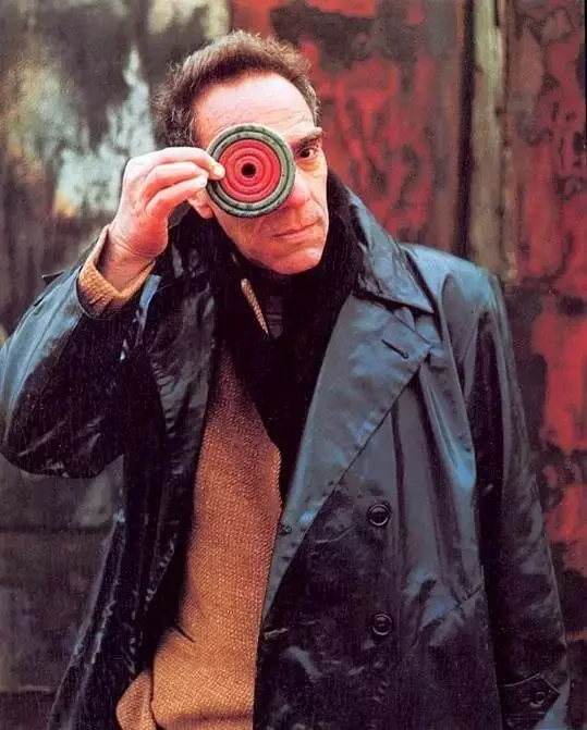
The author: Derek Jarman was an English film director, artist, gardener, and author. One of the first British gay rights activist: openly fought against Section 28 which stated that a local authority "shall not intentionally promote homosexuality or publish material with the intention of promoting homosexuality". Jarman began his artistic career as a painter and set designer, then for a long time made home movies and became famous after the film Caravaggio. Jarman’s visionary art film about the life of the Italian artist won the Silver Bear at the Berlin Film Festival and made it to the list of "The Time Out 100 Best British Films."
Photo: www.2do2go.ru
The book: The Russian translation of the book Chroma has an amazing story. This laborious, poetic translation, requiring immersion into several cultural layers was made a few years ago by film expert Anna Andronova, Jarman’s big fan. She translated individual chapters and shared them in her blog — simply because it was interesting and because "the concepts that will be easily available on the Internet will win". Anna published the final full translation of Chroma in open access absolutely free. The book spread all over the Internet — and now that Ad Marginem Press, a small private publishing house, together with the Garage Museum of Contemporary Art, has published it, it is impossible to remove all unofficial digital copies of Chroma from the Internet. Yet, Chroma in hard copy is quite a powerful artefact, it is not one of those books that are deleted from electronic devices after reading.
You can even tell your fortune, randomly opening different pages from Chroma and reading them — this is a shaman’s book, you can even chant its fragments which appear to be pure poetry. It can also serve as a manual on associative and figurative thinking, on the construction of a rhythm. Moreover, you’ll definitely find the book’s chapters very useful when using some colour or trying to justify your choice of using it. Jarman strings associations, idioms, literary characters, pictorial and everyday traditions and even children’s folk songs on the colour rod. He is frank, like a dying person, who is no longer ashamed of his hospital drips or youthful sexual fantasies.
Quotation: "Chrome green and permanent green are modern inventions. The dangerous emerald green is no longer manufactured. The under painting of many Renaissance paintings is green, which gobbles up the pink, so the face of Masaccio’s Madonna has taken on the green hue of a ghost. She holds the tough little Messiah on her knee, while he reaches out to seize a bunch of purple grapes. She is sitting on a bishop’s throne of marble, from behind which peeping perspective angels peer at us. There is no more maternal Madonna. What is maternal? Practical, perhaps? You can see that she could get angry with this child, and you can imagine her boxing its cars. She is not one of Raphael's or Botticelli's Parisian models, more a Page Three Girl with a green face, who has to work hard at some other job. In spite of the mistreatment, her son could grow up a treat. Even though her husband Joseph is not his father and is not in the picture. Is this a one-parent family that contradicts all of the unattainable ideals?"
Drawbacks: Jarman talks with his readers as an equal, assuming their breadth of mind and not going into unnecessary detail. He quotes Kandinsky, Malevich, Aristotle, Goethe, Wittgenstein and Chaucer without quotation marks, using their statements as part of his own text. Jarman shamelessly goads curiosity and makes you go read books, look for paintings, and watch movies. In order to understand everything he means.
Author: Anna Sidelnikova


